— Ideas & inspiration
Store composition
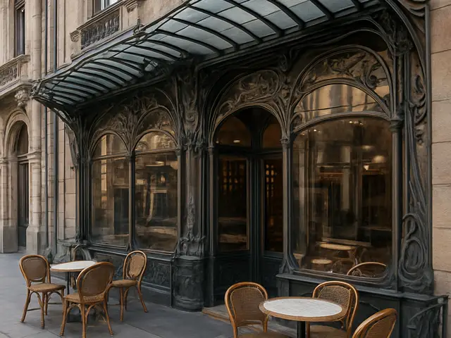
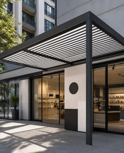
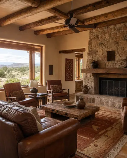
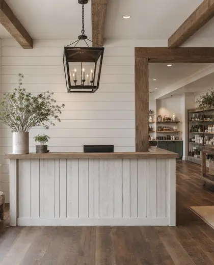
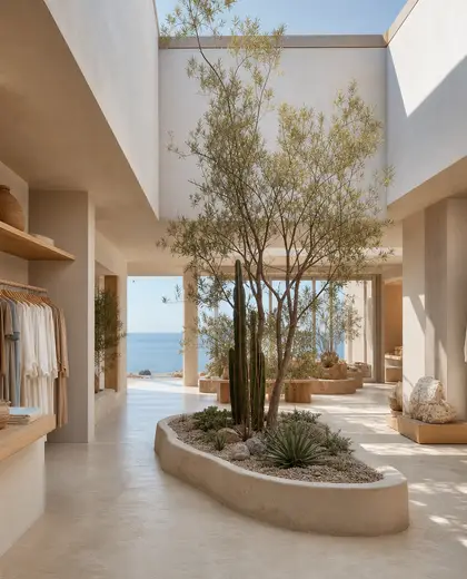
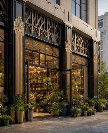
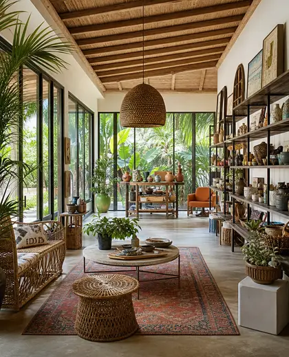
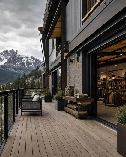
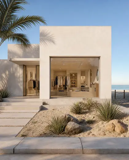
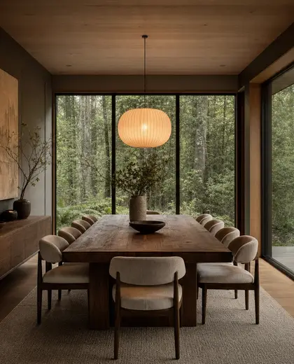
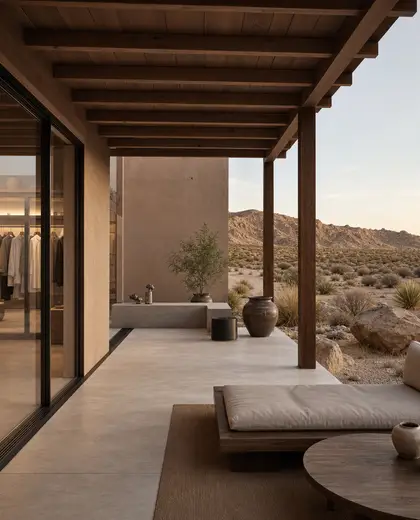
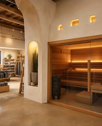
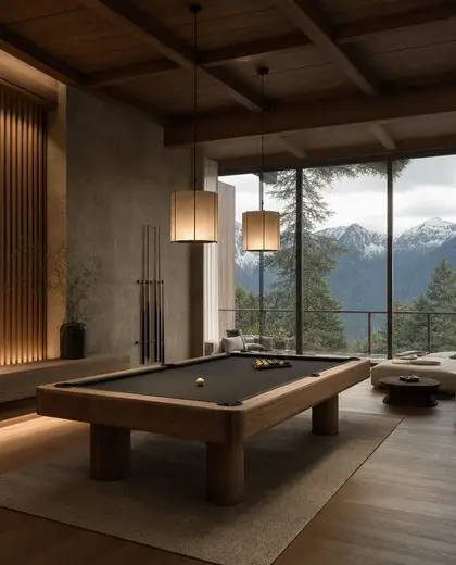
Store interiors are defined by clear merchandising structures, durable finishes, and a layout that keeps products visible and easy to reach. Common materials include glass, metal, painted timber, laminate, and polished concrete, often paired with neutral walls and a restrained palette that lets the merchandise stand out. Shelving, display tables, signage, and focused lighting are the main elements that shape the space.
- store
— References
References to explore

What makes a store composition different from a home interior?
A store composition prioritizes visibility, circulation, and durable surfaces, with furniture and fixtures arranged around products rather than personal use.

Can this composition work for a small shop?
Yes. Smaller stores usually use tighter shelving, wall-mounted displays, and simpler finishes to keep the floor plan open and easy to navigate.
Does a store always need a neutral palette?
Not always, but neutral backgrounds are common because they help products read clearly. Accent colors are usually used in signage, feature walls, or display zones.
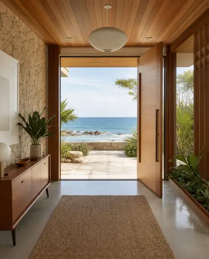
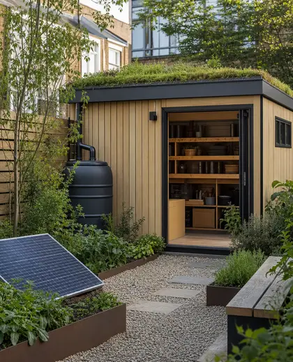
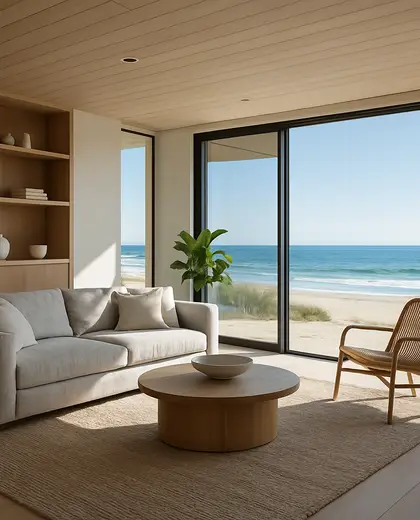
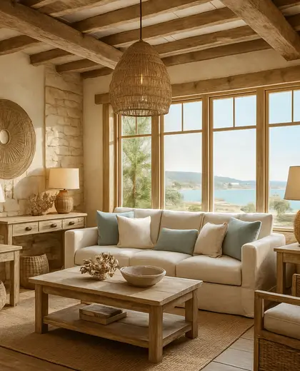


— The style
What defines it
Glass, metal, timber, laminate, and concrete are typical because they handle heavy use and frequent rearrangement.
Most store compositions rely on neutrals such as white, black, grey, beige, and natural wood tones, with accent colors used sparingly.
It works with shelving, display cases, checkout counters, storage walls, mirrors, and track or spot lighting.
— Professionals
Who has already built it
- vorbild architecturearchitects · 6 projectsView profile →
- kerem erbagci3d renderers · London · 9 projectsView profile →
- paquis norris group limitedbuilders · Reading · 3 projectsView profile →
- LoftRobejoiners · Guildford · 4 projectsView profile →
— Explore
Keep exploring
— Questions
Frequently asked questions
What makes a store composition different from a home interior?
A store composition prioritizes visibility, circulation, and durable surfaces, with furniture and fixtures arranged around products rather than personal use.
Can this composition work for a small shop?
Yes. Smaller stores usually use tighter shelving, wall-mounted displays, and simpler finishes to keep the floor plan open and easy to navigate.
Does a store always need a neutral palette?
Not always, but neutral backgrounds are common because they help products read clearly. Accent colors are usually used in signage, feature walls, or display zones.